Intro:
Welcome, fellow web and graphic designers, to a world where dimensions matter! As content creators, you must be aware that the quality and success of your Instagram posts depend on more than just your artistic talent. Yes, you heard that right – size matters, especially regarding the best Instagram post size. In this blog, we will dive deep into the world of pixels and dimensions to help you create visually stunning and engaging content for the ‘gram. So, let’s get started on this journey to Instagram perfection.
The Classic Square Post: 1:1 Aspect Ratio

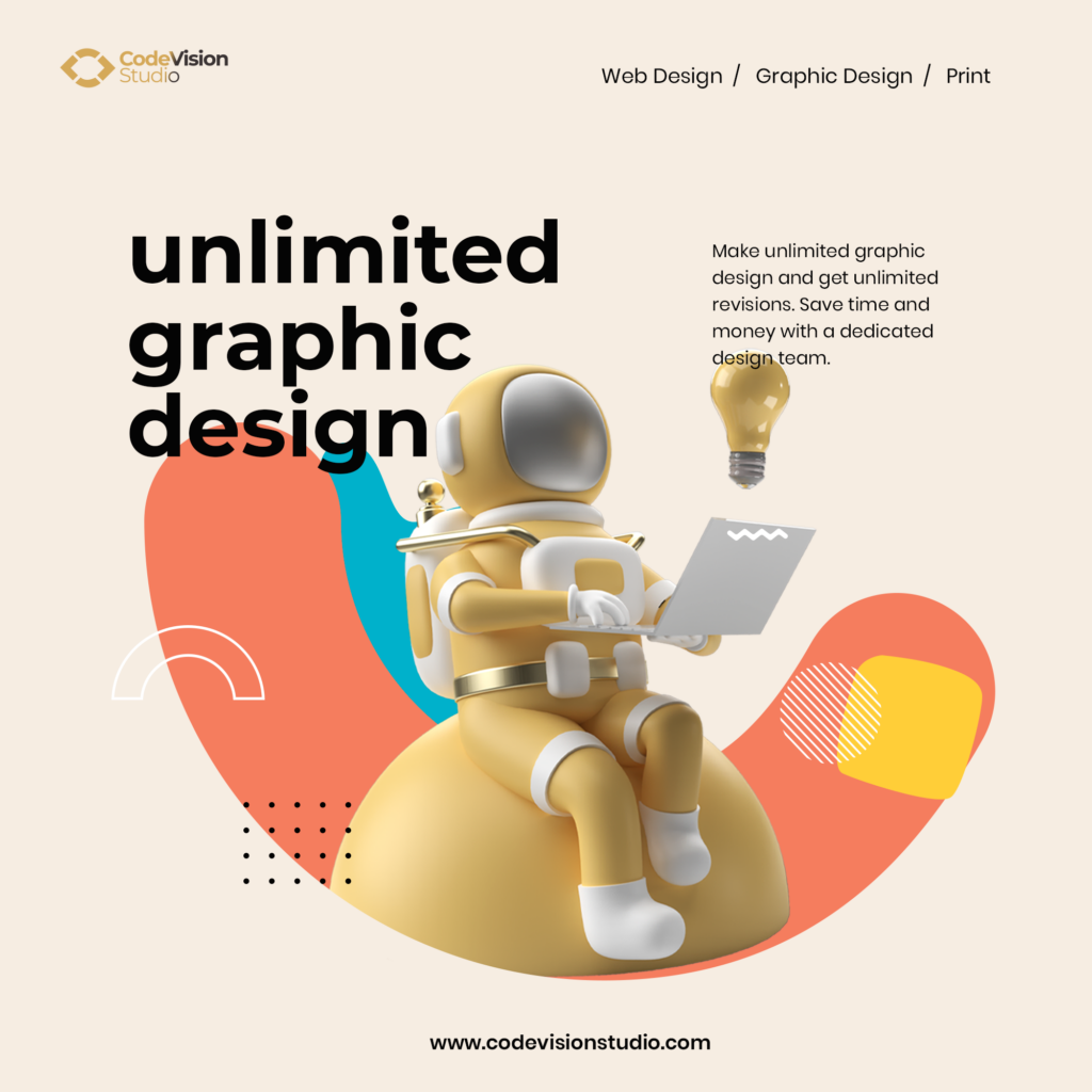
The most classic and widely used Instagram post format is the square post. Measuring 1080 x 1080 pixels, this format is perfect for displaying your designs without cropping or distortion. The square format works exceptionally well for bold, minimalist designs and visually striking images that can stand out in the cluttered Instagram feed. Additionally, it’s the perfect choice for creating a cohesive and visually appealing grid layout on your profile.
The Landscape Post: 1.91:1 Aspect Ratio

The landscape post is your best bet for panoramic views, wide-angle shots, or intricate designs that need more horizontal space. This format measures 1080 x 566 pixels, allowing your plans to breathe and capture the viewer’s attention. Landscape posts are particularly suitable for showcasing web design projects, infographics, and illustrations that require a broader canvas. However, remember that the landscape format may appear smaller in the Instagram feed. Make sure your designs are clear and impactful.
The Portrait Post: 4:5 Aspect Ratio

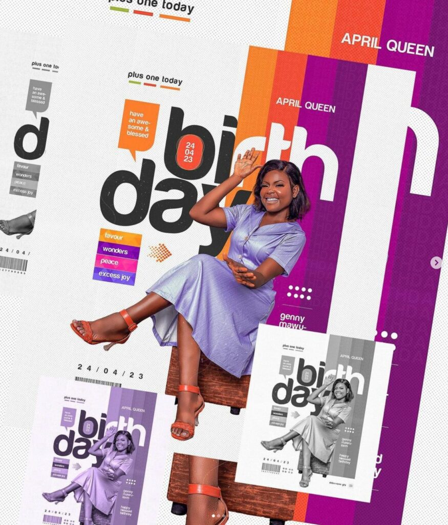
When you want to create a dramatic impact with your designs, go for the portrait post. Measuring 1080 x 1350 pixels, this format provides ample vertical space to showcase your designs in all their glory. Portrait posts work exceptionally well for fashion, typography, and vertical layouts. Since they take up more screen real estate in the Instagram feed, portrait posts are great for capturing your audience’s attention and making a statement.
Instagram Stories: 9:16 Aspect Ratio
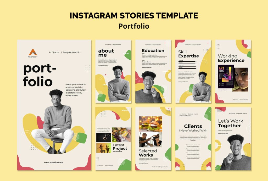
With over 500 million daily users, according to DemandSage, Instagram Stories is an indispensable tool for content creators and designers. The full-screen vertical format measures 1080 x 1920 pixels, providing your audience with an immersive and engaging experience. Stories showcase behind-the-scenes content, work-in-progress designs, and time-lapse videos. Additionally, the 24-hour lifespan of Instagram Stories makes them a great platform to experiment with new design styles and receive instant feedback from your audience.
Carousel Posts: Mix and Match Aspect Ratios
Carousel posts are the way to go when you have multiple images or designs to showcase. You can use up to 10 photos in a single post and mix and match aspect ratios. This style is ideal for showing a collection of connected designs, showcasing a design project from beginning to end, or even producing a mini-tutorial. Carousel articles give your viewers a dynamic and exciting experience while giving you the freedom to present your designs in many ways.
Conclusion:
Size is essential in the Instagram universe. For your posts to appear great and leave a lasting impact, you must make the appropriate size selections as a web and graphic designer. Whether you’re a fan of the classic square, the broad landscape, the dramatic portrait, or the engaging carousel, understanding the best Instagram post size will help you make your designs stand out in the ever-evolving digital landscape. So, keep experimenting, creating, and dazzling your audience with picture-perfect Instagram posts!
Louise Myers inspired this blog.